- These elements may not contain children.
- These elements should be located in a Form Page element
Buttons
Depending on which behavior you want, you can either add button elements (single or row) or configure the form page.Button element
The button element adds a single button.Button row element
The button row element adds multiple buttons.The name of each button (ok and cancel in this case) must be mapped to scripts in the Buttons tab.
Configure the form page
Add button in Simple values tab:Regardless of whether you use simple values or the creation script, the name of the button must be mapped to a script in the Buttons tab.
Button actions
When the user clicks a button in an interactive screen (form), something should happen. You have to create a CRMScript to describe that something. This example shows what happens when someone clicks Cancel in the Edit ticket screen.Checkboxes
A checkbox is an input element used to let a user select an option. It is shown as a square box that is ticked when activated. For example, you might want the user to accept terms or opt in before submitting the form.- Add an element of type checkbox where you want it to appear.
- Set simple value
labeland optionallysuffixLabel.

Mark a checkbox
To mark a checkbox in a script, callsetValue():
Radio buttons
A radio button is an input element used to let the user select only 1 option from a predefined set. The options in the set are mutually exclusive.- Add an element of type radiobuttons where you want it to appear.
- Set simple value
labeland then specify each option. Remember to setbuttons.lengthaccordingly.
 Next, we’re adding another option and changing which option is selected in the creation script:
Drop-downs
A drop-down is an input element used to let the user select exactly 1 option from a list.List-box element
To add a custom drop-down menu:- Add an element of type list box where you want it to appear.
- Set simple value
labeland then specify each option. Remember to setoptions.lengthaccordingly.
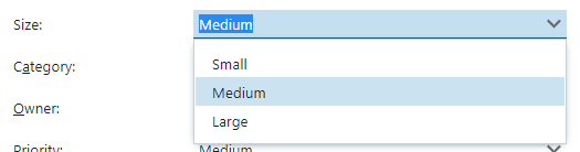 Next, we’re replacing an option in the creation script:
MDO list element
Adds a drop-down menu with values from an MDO list. You must specify which list you want to use.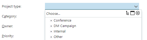
Related drop-downs element
Adds a custom drop-down menu where the options depend on the value selected in another drop-down. In tree mode, you get 1 drop-down with a multi-level list.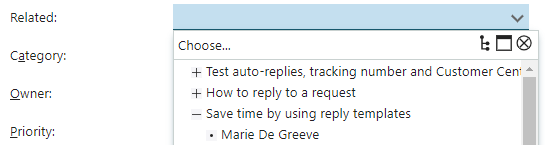 In list-mode, you get n drop-downs, either side-by-side or in a vertical list. Each level has its own label.

Example
Let’s assume we’re creating 3 drop-downs:- request
- customer
- the customer’s email
Folder explorer (tree explorer)
A folder explorer sets up information in an expandable tree. Think of it as a manually crafted multi-level menu. You build the tree by adding nodes and setting parent ID to the direct ancestor - except for the root node.- Add an element of type folder explorer where you want it to appear.
- Set simple value
label. - In the creation script, start by setting up the root node.
- Next, add level-2 children with
parent.idset to the ID you chose for the root. - Continue adding childe nodes at increasingly lower levels.
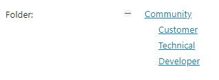
Text
For alphanumeric input, you can choose either a single-line field, a multi-line field (area), or an editor.Text element
Text restricts you to 1 line, but allows you to place restrictions on size and expected contents. This example sets up a field that requires a decimal number (float):
Text area element
For multi-line input fields, you need to specify the size of the area. You can’t place restrictions on expected content as you do for Text elements.Language menu element
Displays a drop-down with different languages. Used by the spell-checker for input fields.
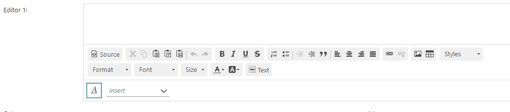
CK editor
The CK editor lets users create HTML-formatted messages. They can insert images, tables, paragraphs, and so on. The editor must be inside anElement table. It is often placed directly before a ContactAndRecipient element, but it doesn’t have to be.